Choosing the Best Font for Your Proposals
Aug 30, 2024
5 mins
When creating a business proposal, every detail counts. You need to make sure your visuals and formatting are on point. You have to structure the proposal logically. You need to write and rewrite paragraphs until you're absolutely sure you've eliminated all potential confusion points for the client.
In addition to all that, you also have to pay attention to the length so you don't end up overwhelming your client with too much information. Between so many things to watch out for, it's sometimes too easy to miss one seemingly small detail - your font.
Why font choice matters in business proposals
Choosing a font for your business proposals isn't just about the aesthetics. The font you choose has a direct impact on how the content of your proposal is perceived.
You want to choose a font that enhances readability, sets the right tone, and ensures that your message is communicated clearly. Otherwise, you risk distracting your client or, even worse, looking unprofessional and not credible.
Studies have shown that people subconsciously attribute personality traits to fonts, just as they do with colors. This means that the font you choose communicates more than the words written in it.
Your font tells clients what kind of business you're in and affects how seriously and positively they perceive you. To make your business proposal font choice easier, here are some common associations people have with different font types.
Serif fonts

Common associations: trust, traditionalism, reliability, respect
Examples: Times New Roman, Georgia, Garamond
Serif fonts (the ones with little "legs" at the ends of the letter strokes) date back to the earliest days of print. Pair this long-standing presence with the fact that they're usually used in institutions like universities, law firms, and financial services and you get collective consensus that serif equals formal and authoritative.
Psychologically, this makes perfect sense. When you think about where you're most likely to see a serif font, it's usually books, academic journals, or legal documents. Since we see them in all the places we link to credible information, it reinforces the idea that serif fonts are reliable and can be trusted.
Sans serif fonts

Common associations: modern, clean, approachable, welcoming
Examples: Arial, Helvetica, Calibri
If you've read anything on a screen, chances are you've read it in a sans serif font. Since they don't have the end strokes that come with a serif font, they won't blur on low-resolution screens, which is why they're popular in digital use.
Compared to the traditional feel of serif fonts, sans serif fonts are perceived as more casual and approachable. Their straightforward design makes them feel less intimidating and more accessible, making them a popular choice for businesses that want to come off as friendly. When paired with preppy fonts, they can bring a modern and stylish personality to your brand.
From a psychological perspective, sans serif fonts are often seen as neutral, objective, and unbiased. They don't carry the historical weight or formality of serif fonts, which makes them suitable for everything from business reports to advertising.
Handwriting fonts

Common associations: elegant, creative, stylish
Examples: Brush Script, Nautica, Fertigo Script
As the name suggests, these are the fonts that mimic the look of human handwriting. Depending on the style, they can be either script-like or more casual.
While they do add a personal touch, handwriting fonts can negatively impact readability and give off a tacky impression. If you're using them in business proposals, it's best to not overdo it. A header or two for emphasis is fine, but using these fonts in the main body of text will just overwhelm or frustrate the reader.
How to choose the right font for your proposals
Now that you know what associations people make with different font types, you know that your font choice should be determined by:
-
The nature of your business proposals
-
Who your customer is
If your font doesn't match your content, it will look out of place. For example, if you're in the finance business, you'll benefit more from a serif font than, for example, a tech startup would.
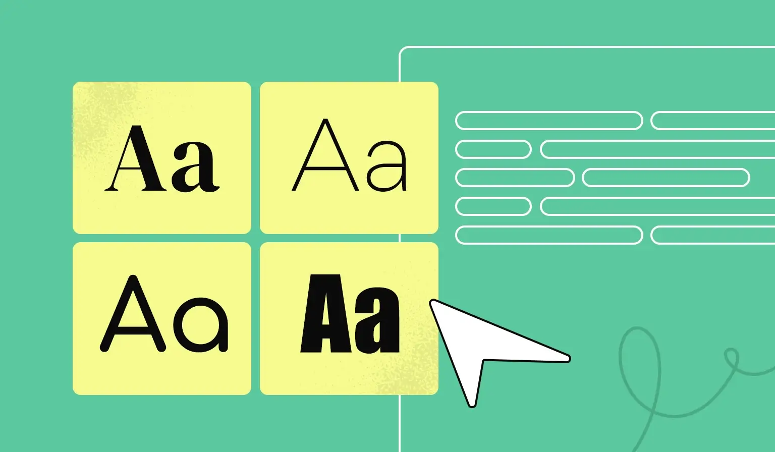
To get a cohesive look, you can use the same font throughout your proposal and use different weights for headings and body text to create a clear hierarchy. Alternatively, you can try pairing two different fonts together using an online tool.
Whatever fonts you end up choosing, make sure to test for readability. Clients that don't read your proposal because the font makes them feel tired, overwhelmed, or annoyed won't go through with the deal.
Don't want to go through the hassle of figuring out what resonates best while sifting through thousands of fonts? Better Proposals has your back.
Our font pairing presets are here to remove all your business proposal font worries. Simply click on a pairing you want to preview, hit save, and they'll automatically show up in all your documents.

Better Proposals has them all
Whether you go with a classic like Times New Roman, a versatile option like Arial, or create your custom font, you can use them all inside Better Proposals. In addition to preset pairings, you also have the option to choose between Google and Adobe fonts. And if you want to stay completely on brand, you can also upload your own custom fonts to make your proposals look and feel just like your website.