What All Great Proposal Cover Pages Have in Common (With Examples)
Think of your proposal cover page as walking into a meeting. Before you’ve said a word, the client's already decided whether you look like someone they can trust.
That's exactly what your proposal cover does: it sets the tone for everything that follows. And just like in person, that first impression lingers long after you’ve walked into the room.
Make the first impression count
The best covers don’t try too hard. They simply say that you know who you are and you know what you're doing.
How do you achieve that?
Three words: consistency, clarity, relevance. Get those three right, and you’ve already won half the battle.
First, make sure your branding is flawless. Your logo needs to be sharp, your fonts uniform, and your colors in line with the rest of your brand. Clients notice when you care about the details and they notice just as quickly when you don’t.
Then, include only what matters. Your logo, the proposal title, their name or company name, and who it's from.
If it's a limited time offer, you might want to add the sending date as well. But that’s it. Anything else is noise.
As for the design, the tone of your cover should match the tone of the work inside. For example, a financial services proposal should feel solid and trustworthy, but a marketing proposal can be a bit more playful.
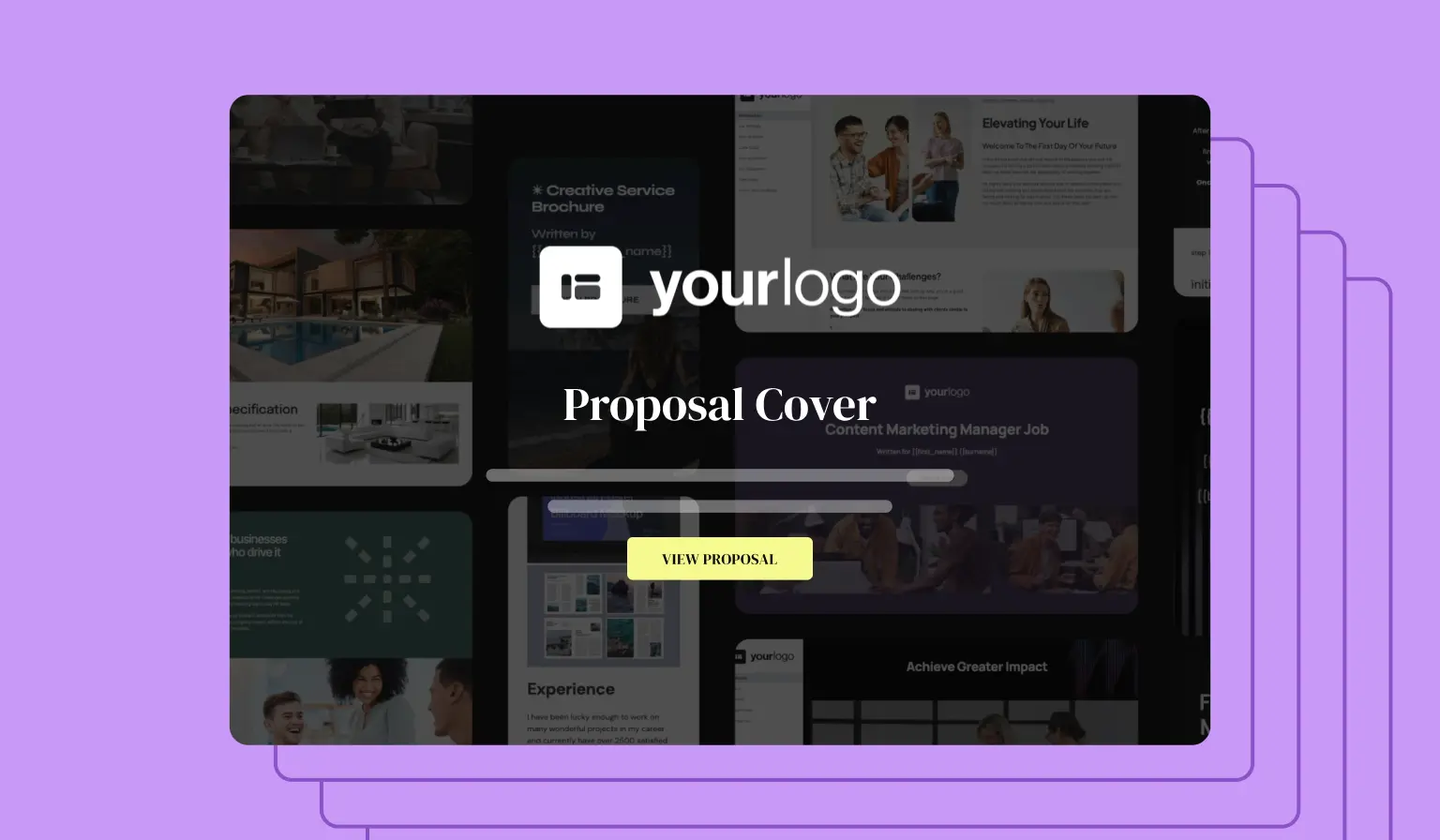
Three covers that prove the point
If you're more of a visual type, we've got you covered. Let's take a look at three proposal covers that show what consistency, clarity, and relevance look like.
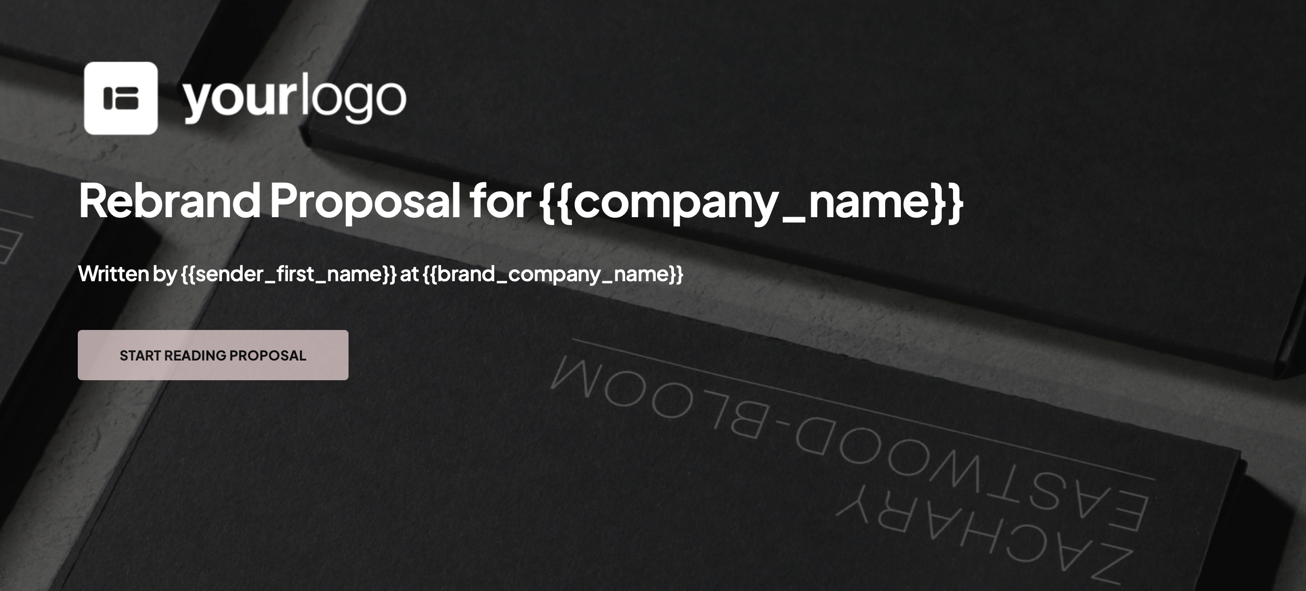
First up, we've got a sleek, minimalist cover for a rebrand proposal. It feels deliberate, confident, and elegant. And that's exactly the point - when you're pitching design work, the proposal itself is proof of your skill.
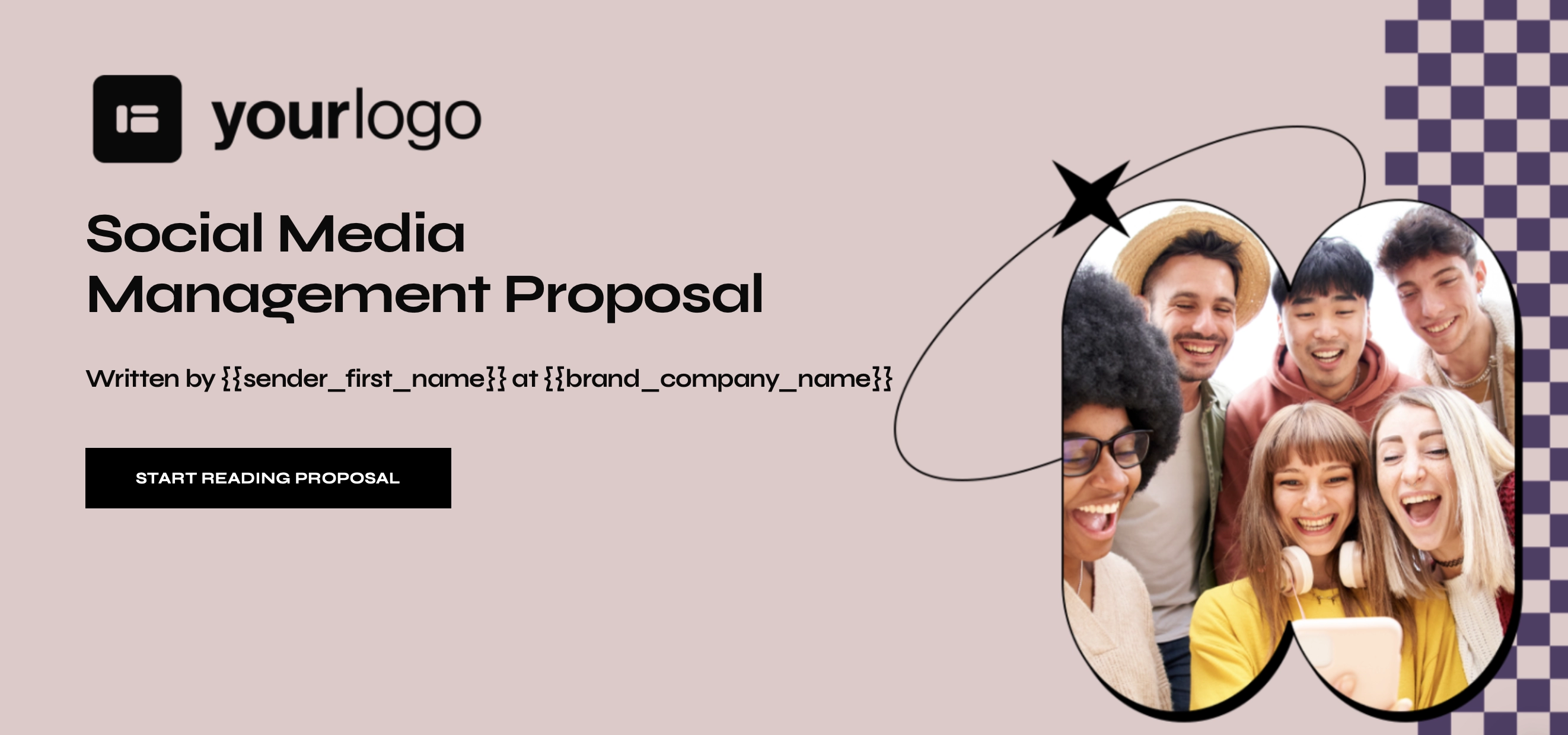
Here, the tone shifts to playful, which is what you’d expect from a team selling creativity and online engagement. The colours are bright, the fonts are bold, and the imagery feels modern and human. It has energy, but it doesn't feel messy.
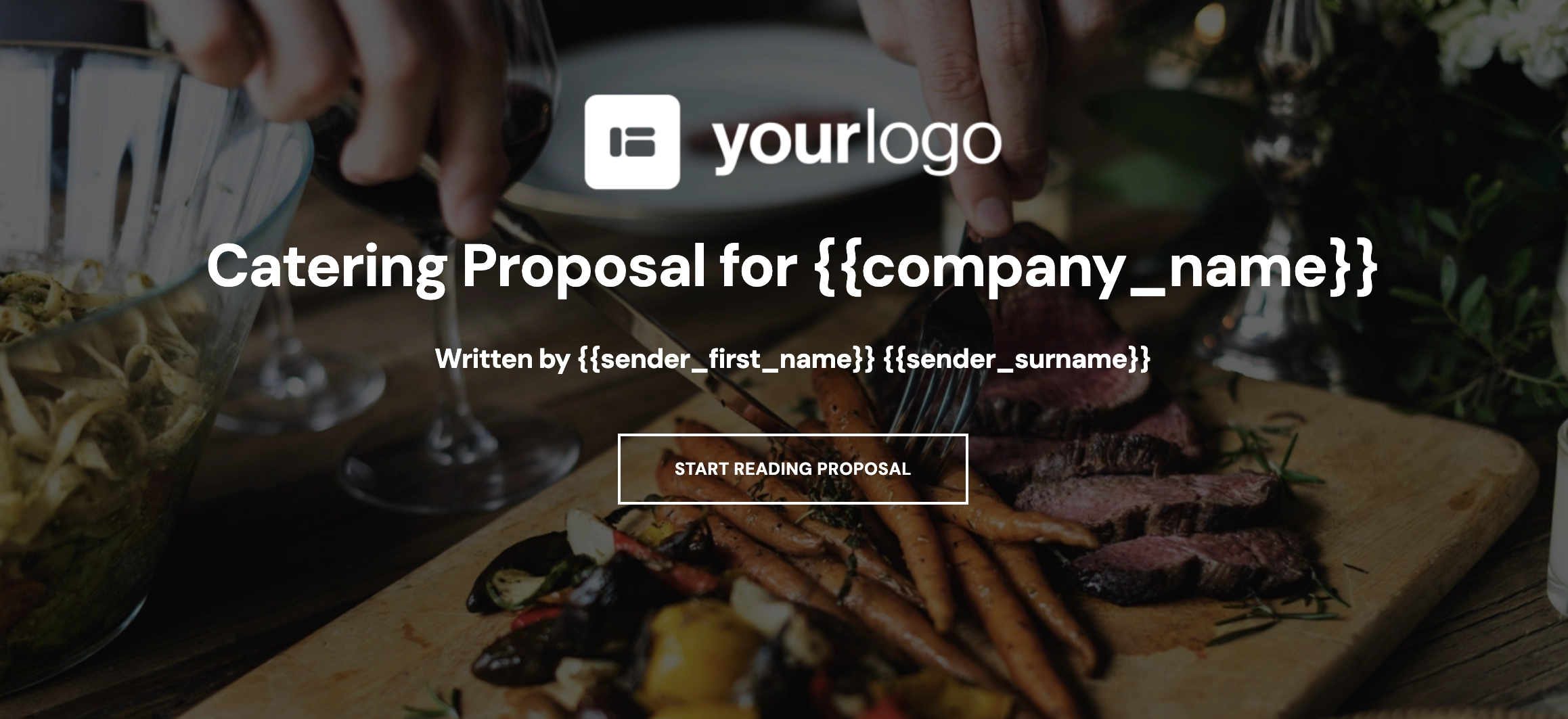
And when creating a catering proposal cover, you can't go wrong with an appetising background image. Food is visual, so why not open with a taste of what they'll be getting? A simple photo from a previous job gives the client confidence in your standards and instantly sets the right mood.
Notice what all these covers have in common? The essentials are laid out simply: logo, proposal title, client’s name, sender. That’s it. Clear, professional, personal, and with zero clutter.
Your proposal cover has only one job...
...And it's to make the client want to get to the next page. Sure, the cover alone won't win you business. But people judge fast, and they remember their first impression of you.
Get the cover right, and you’ll come across as credible before they've even read the introduction. And when they get to it, they'll already be on your side.