How to Use Visuals for a Successful Product Launch

A product launch is an exciting, daunting moment for any company, and it is when all teams need to gather strength to bring a new product to market and make it a success.
Launching a product is a complex process with a lot of teamwork and several steps involved, and it is challenging to accomplish this task in an organized, fluid way. With so many people, so much research and planning required, it is easy to get lost. That's why we need to prepare a product launch long in advance.
The to-do list includes defining positioning and tone of voice, communicating with stakeholders and teams, organizing activities, finding the best content library, and more. A highly visual product launch strategy helps complete these tasks more efficiently, anticipate the outcome, collect valuable feedback from early users, and build industry recognition.
Keep reading to find actionable tips on using visuals to achieve your product launch goals.
Why use visuals in the first place?
A product launch needs to be planned months ahead. Organizing tasks, deadlines, milestones, resources, roles and keeping everyone on the same page is challenging, but you can make it easier by using visuals.
Visuals are excellent for keeping all the activities on track, monitoring progress, and helping teams work towards a singular objective. Also, when it comes to engaging your target audience, driving leads, and promoting your product, visuals will help scale your content strategy. Let's see how to use visuals to accomplish each of these tasks flawlessly.
Get to know your customers
A recent report by Salesforce has shown that only 37% of customers think brands generally demonstrate empathy, but 66% also said that they expect companies to understand their needs and expectations. Also, 80% of customers believe that the experience provided by a company is as important as its products. This means most companies are missing the point when it comes to pleasing their audience.
And it is easy to understand why. When you have a diverse target audience and need to share content to engage people on multiple channels, how to deliver personalized experiences?
To win customers’ loyalty, you have to define a voice for your content marketing according to their expectations and needs. But sometimes, marketers tend to idealize their user personas, which end up not fitting their real customers' desires.
That's why creating well-defined user personas is a critical step when planning a product launch. To create more realistic personas, consider making them visual and diverse. Let's see why and how.
What is a visual user persona?
A visual persona is usually presented as an infographic containing a brief introduction, photo, graphs, icons, and tables to present users according to demographic and psychographic data. These design elements make it easier to define personality traits, such as introvert versus extrovert, thinking versus feeling, and so on:

This information will help you set the voice of your product’s communication more accurately and make it easier for your content creators to understand your target audience's characteristics, as most people are visually oriented. Also, visual personas will help you impress prospects when creating a pitch deck for fundraising, like in this pitch deck slide from Dwolla, a payment platform:

Tips for creating a visual persona
Name your personas
Giving your buyer personas a name will help you think of them as actual people.
Research motivations and pain points
What are their motivations, needs, desires, pain points? How can your product help them with that? Or, if your product has nothing to do with a given pain point, how can your content make your audience feel understood by your company?
Highlight the difference
If you are going to create three to five visual personas, they should have different needs and motivations. To make your campaigns properly segmented, it is worth highlighting the differences between your personas. And you can highlight differences and make comparisons by presenting your personas on a comparison sheet or infographic.
In the example below, you can see three personas at a glance and compare them much faster:
Social media and tech use
Buyer personas' favorite social media platforms should be included. Say you have a well-defined persona called John, but you don't know where to reach him. Not much of a help, right?
Defining each persona's favorite social media channel and tech preferences will help you set the tone of your content for each channel and avoid wasting time.
Include an introduction paragraph
Visuals are great for communicating in an engaging, memorable way. Still, we need some contextualization and backstories, so adding a brief introduction paragraph will help you tell a compelling, real story. Keep it short and straight to the point.
Other important factors to include
- Geographic location;
- Salary range;
- Age;
- Goals that your product will not impact;
- Goals that your product will impact;
- Favorite brands;
- Interests;
- Aspects related to your product. Say you are launching a premium ground coffee brand. In this case, it makes sense to include your persona's favorite beans and coffee brewing methods.
Use templates
Creating a visual persona from scratch may be daunting. Your task will be much easier if you already have a ready logo design and rely on free slide templates you can find on the internet. Templates allow you to customize texts, icons, images, graphs, bars, fonts, etc. So give it a try and forget about the old-fashioned, dull, merely textual personas. Using AI-powered photo editor online tool like Picsart, Phot.AI or Luminar Neo, you can further enhance your images and create custom graphics and custom logo design that perfectly align with your brand. So give it a try and forget about the old-fashioned, dull, merely textual personas. By using these tools and resources, you can create a visually appealing and cohesive brand image that resonates with your target audience.
Planning a product launch
When planning your product launch, you will need to set goals and time frames to complete tasks and achieve milestones. The best and easiest way to do this in a helpful way for all teams involved is creating timelines to plan events far into the future, present an overview of schedules and highlight critical information and points.
See this timeline to get an idea of how it works:
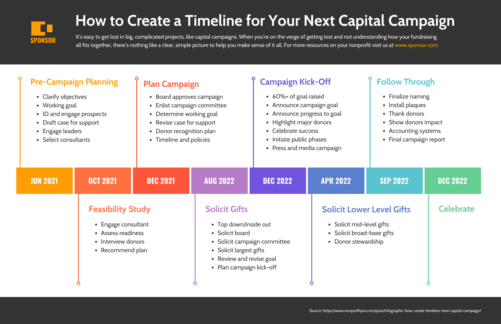
A solid plan now can help you get through your next launch easier in the future. Once you've launched, consider going through a project review so you can assess points that need to be improved next time.
Roadmaps
Like timelines, roadmaps are powerful for organizing and presenting deadlines, teams in charge, tasks, and goals. The main difference is that roadmaps set high-end goals and meet the ever-changing nature of project development, defining tasks, resources, deadlines, and roles. A roadmap will ensure that teams are up-to-date in the project's evolution, keeping everyone on the same page.
In short, roadmaps are excellent for:
- Setting priorities and high-level goals for each block of time;
- Tracking progress;
- Keeping teams and processes on track;
- Coordinate activities across teams;
- Promoting communication between teams;
- Aligning departments across an organization.
A roadmap must be easily customizable and editable to keep up with the constant evolution of processes, so you can rely on templates to highlight schedules, project plans, and, most important activities. See an example:
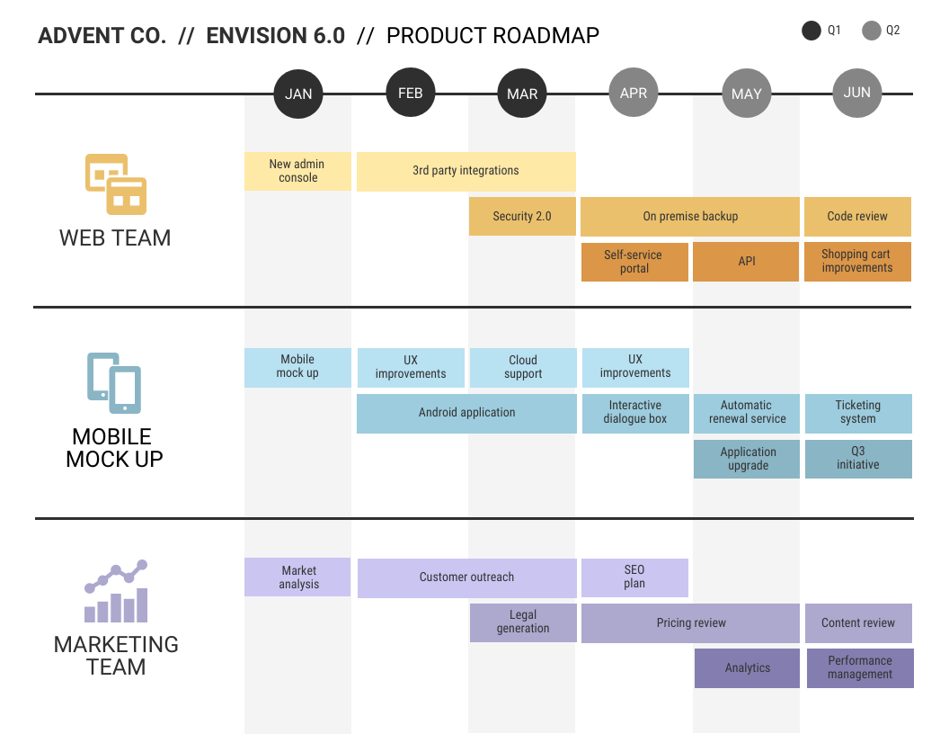
When creating your roadmap, bear in mind your target audience and how far into the future you want to plan. Some stakeholders, for example, might need only an overview, while managers and team leaders need precise schedules and goals for each period.
With a well-designed product roadmap, you can show what each team or individual is working on, from planning a piece of content to implementing a whole new product.
Use product roadmaps to:
- Prioritize tasks and initiatives;
- Track progress toward goals;
- Coordinate activities across teams.
- Set priorities and high-level goals for each block of time;
- Track progress;
- Keep teams and processes on track;
- Align departments across an organization.
- Present deadlines, teams in charge, tasks, and goals.
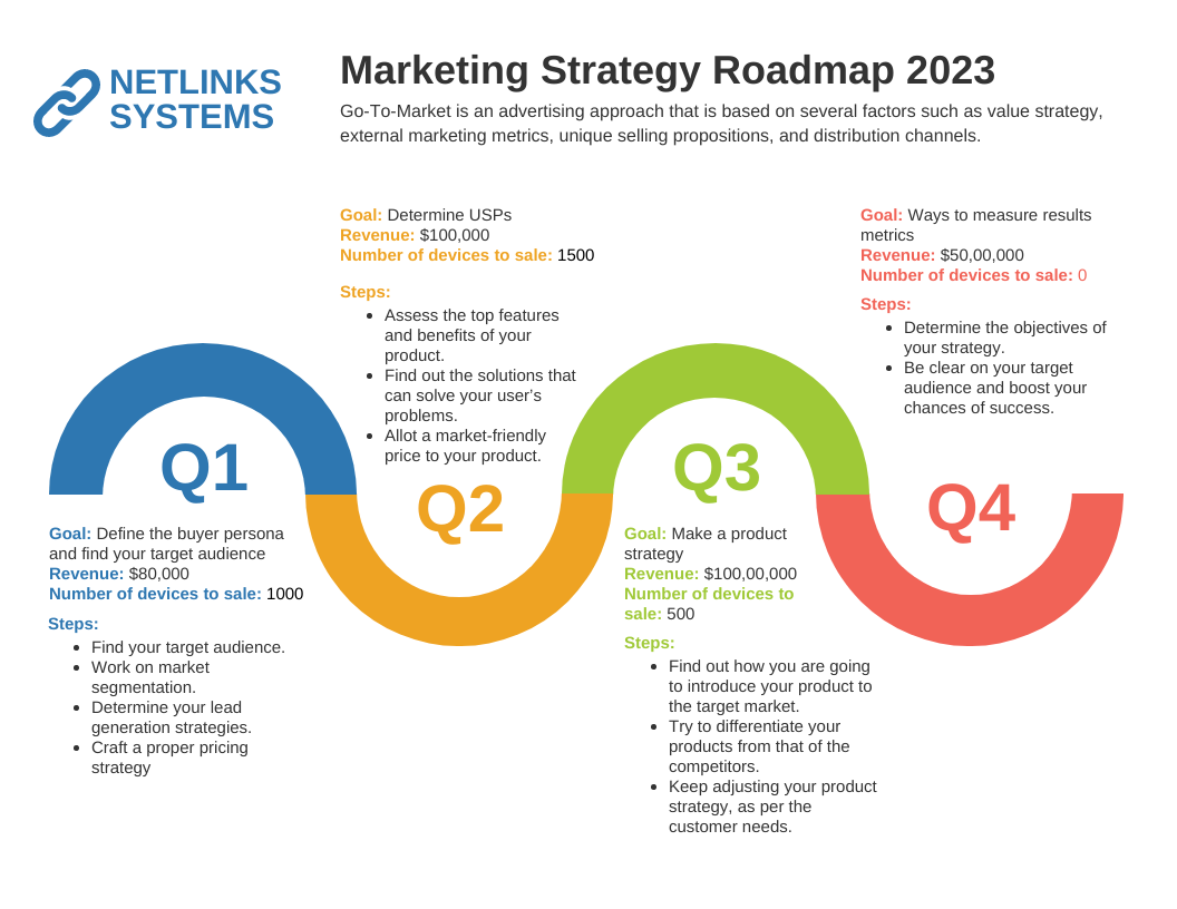
While product roadmaps are represented by a Gantt Chart like the one above, marketing strategy roadmaps are more straightforward. Just like this infographic that spans a year, set high-level goals for each block of time and comprehensive tactics to achieve those goals:
Use mind maps to organize activities and ideas
Mind maps are excellent for brainstorming, outlining strategies, organizing projects, and connecting concepts. You can also use mind maps to improve both internal and external communication. See this product launch mind map, for example, which visually presents objectives, metrics, and marketing channels at sight.
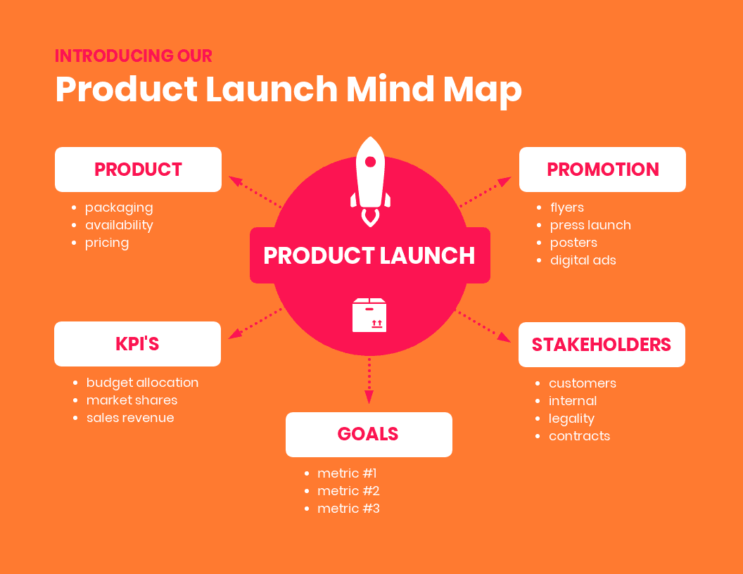
Mind maps will help you develop an efficient communication strategy. When brainstorming, you can create your map from the central concept at the center, branch out secondary ideas, and add bullet points to define tasks, teams, and tools. Just like in this marketing strategy mind map:

Pre-launch visuals to drive leads
Before starting to create content to promote your product, it is handy to have a plan for each customer journey stage to help you to define and deliver the right content to your audience in each sales funnel stage.
See an example of a customer journey map:
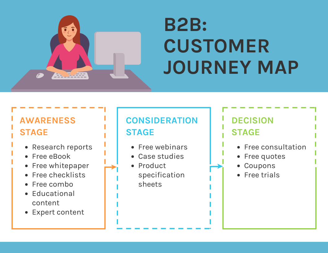
A customer journey mind map like the one above will help you organize your content strategy with a promotional plan, set objectives and tactics for each stage of funnel sale. Your promotional plan should define what type of content you will create for each channel or platform according to your user persona. See an example:


Social media engagement
Images speak louder than words, and that is especially true when it comes to social media, where attention span is lower, and people tend to scroll their feeds only to see what stands out. So you need unique, impactful visual content to succeed.
Infographics are great for engaging audiences on social media because they communicate even complex data in a memorable, visually appealing way. You can easily make infographics and use them, for example, to repurpose top-performing content from your blog. All you need to do is check on Google Analytics and find what engages your audience the most on your blog. Chances are that people on your social media channels will find it interesting too.
Repurposing long-form content into infographics is a time-saving initiative to boost your marketing strategy because it helps you increase engagement on social media and drive traffic to your blog at the same time.
See this Instagram Carousel, for example, that summarizes an entire blog post in an eye-catching, fun way and works as a great teaser to the original content, an article on visual content marketing statistics:
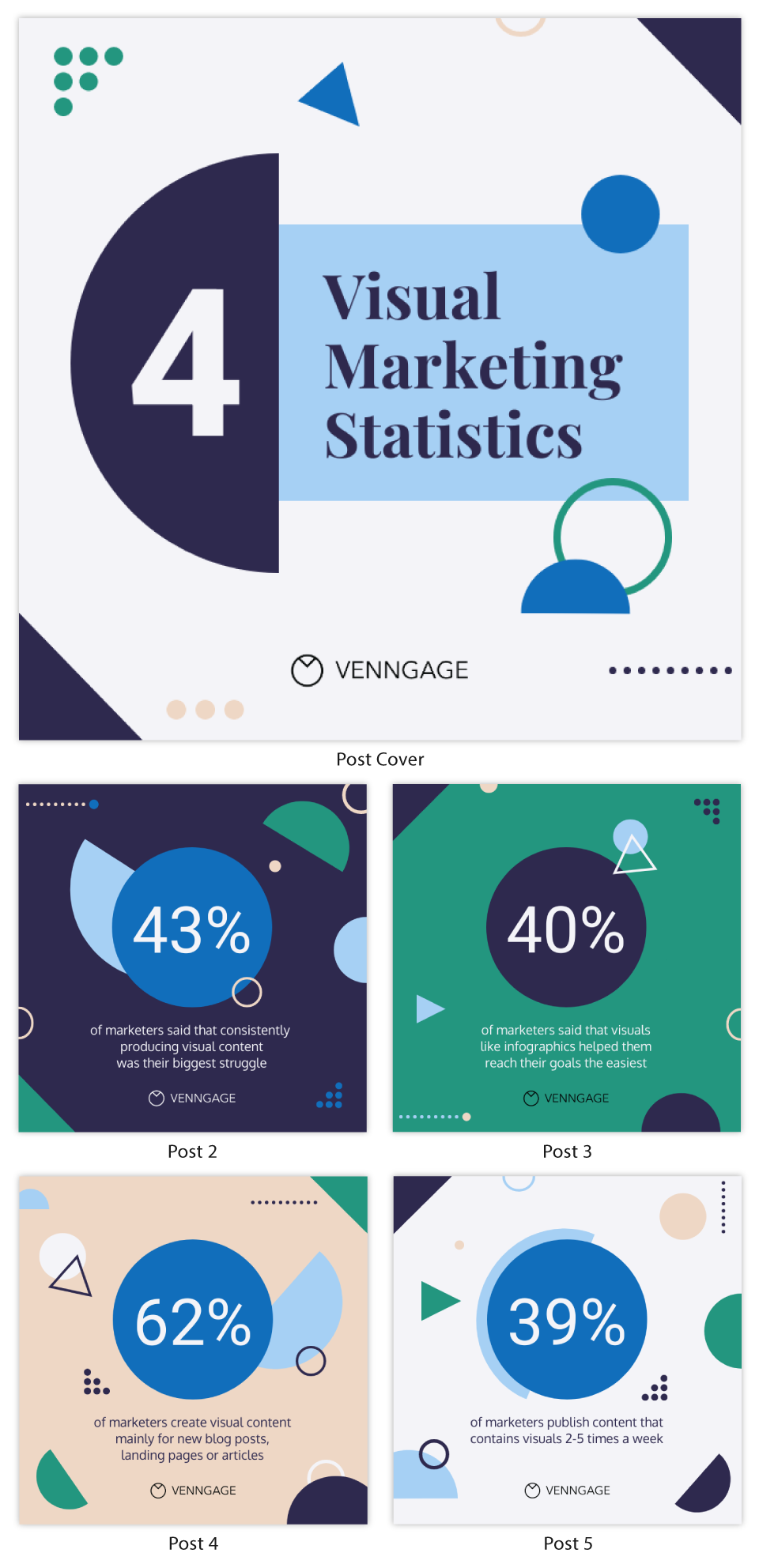
To create engaging Instagram infographics, follow these steps:
- Outline goals
- Collect data
- Visualize data. If you have numbers to present, think of the best way to make it meaningful and easy to understand
- Start with a template. Using an infographic template will make your life much easier, and you can customize dimensions, fonts, colors, icons, images, shapes, graphs, and more.
- Add Style
- Be minimalist and straight to the point. Social media platforms are not meant for presenting large amounts of information in a unique image. Although infographics are great for summarizing data, stick to the main information when it comes to social media graphs.
- Use contrasting colors to highlight key points, so the most critical information will stand out immediately.
- Utilize different colors to create visual groupings.
- Make use of no more than three fonts.
Here is an example of a simple yet engaging, memorable social media infographic:

Newsletters
Regarding email marketing, readers are more likely to engage with images, such as illustrations, graphs, icons, and charts than with merely textual messages.
You can create long-form emails, but consider turning them into infographics, or at least their key points as a summary to draw attention to your message. Making your newsletters more visual will save your audience time and avoid getting them bored and being flagged as spam when sending a follow-up or a new message. Moreover, when you use well-designed visuals, you make sure your main information is assimilated.
Using newsletter templates is also great to get feedback from early customers in order to make improvements to your product. Remember to make it responsive and add a CTA, as the following template:

Show your product value with comparison infographics
Marketers widely use comparison infographics because people sometimes have trouble deciding with so many options on the table. By presenting a product's features side by side, comparison infographics help customers make their minds up quickly and with confidence.
See below how two similar products have their different features highlighted when faced side by side:

Brand videos
In all of their diversity, videos have become the moving force of marketing and have been driving traffic and boosting conversions for several years now. And brand videos play the ultimate role in business promotion. In fact, 66% of Internet users prefer watching a video about a product instead of reading an article about it, no matter how engaging the text is.
A brand video includes your company’s name and logo, shows its products and services, or introduces to employees. It can also include quotes about the company’s values or something else relevant to it, such as awards won by the company or testimonials from customers who love their products. Brand videos offer an emotional experience that is unmatched by other mediums, which can be the difference between making or breaking a purchase decision. They can be used in many ways, such as introducing new products or an event.
Brand videos are a great way to get your message across without having to take the time and money for a full commercial. This means you can use a video-making tool of your choice and create a video yourself or have your marketing team do it and don’t turn to expensive external video production services.
Finding what makes your product unique
There is a not-so-common usage for comparison infographics that you can rely on when planning a product launch: finding what makes your product unique and how to stand out from the competition.
When planning a product launch, you can have valuable insights by comparing features to find out something important to highlight.
Say you are launching a phone, Samsung Galaxy S7. What would you highlight?
Imagine that your goal was to present the largest storage and the lightest phone on the market when creating this smartphone. But it turns out that your competitor had a more ambitious idea for that, overcame you, and when comparing features, you find out that your product has the bigger screen and the best resolution.
So when promoting your product, even if it isn't what you intended to focus on, it might be a good idea to highlight the better typing and reading experience and the best videos on user's Instagram, for instance. Additionally, consider emphasizing how your product can boost their online presence, attracting more attention with a larger base of engaged Instagram followers.
Conclusion
Visuals can make a product launch plan straightforward, clear, and effective, with measurable goals and well-defined tasks. Visuals will help you organize ideas, conduct research, and make it easy to follow a script. They lay the groundwork for a successful launch by giving future customers a taste of what's to come. Because what is product adoption than a direct reflection on how successful your launch was?


