How a Real Business Proposal Started Losing Trust on Page One
A typical business proposal example you find online is made up. It shows you what a proposal should look like after somebody has already polished away all the awkward parts.
Today, we aren't looking at a fake proposal assembled for a blog post. We're looking at a real business proposal sent by an agency after receiving a brief, doing a discovery call, and having every opportunity to ask questions and understand the project.
The only thing we've changed is the name, because who sent it doesn't really matter. What matters is understanding the moments where confidence is built or lost. Let's break it down, section by section.
The brief
Before we get into the proposal itself, here's the context. The project was a redesign of an existing event website across desktop and mobile.
The objectives were fairly clear:
-
Create a stronger visual identity and a more exciting feel
-
Better communicate the energy of the event
-
Improve the visitor journey across the website
-
Increase ticket registrations, VIP package interest, and donations
Now let's see how the proposal approached it.
The cover
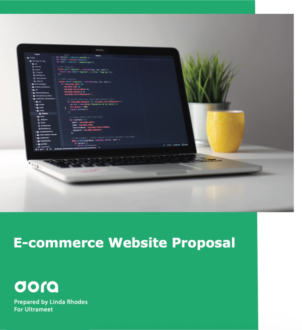
At first glance, the cover actually does a few things well.
It includes the agency branding, the event name, and clearly signals that this is a proposal for a specific client. There is a stock image of a laptop with code for no better reason than technology equals glowing screens, but at least it gives the page some visual structure.
Then, we have the first problem: it's titled "E-commerce Website Proposal". This would have been perfectly fine if the project was an e-commerce website, but it wasn't.
The cover page on a proposal has one very simple job: reassure the reader that they're looking at something created specifically for them. Instead, it's done the opposite.
Look, people know everyone uses templates. Nobody is expecting you to create each proposal from scratch.
The problem here isn't using a template. It's letting the template show.
It makes the proposal feel recycled and reminds us reading it that we're one of ten proposals being sent that week. It also makes us ask questions we weren't asking before.
Did they understand the brief? Did they listen on the call? What else have they copied over?
And we've only just reached the cover.
The introduction
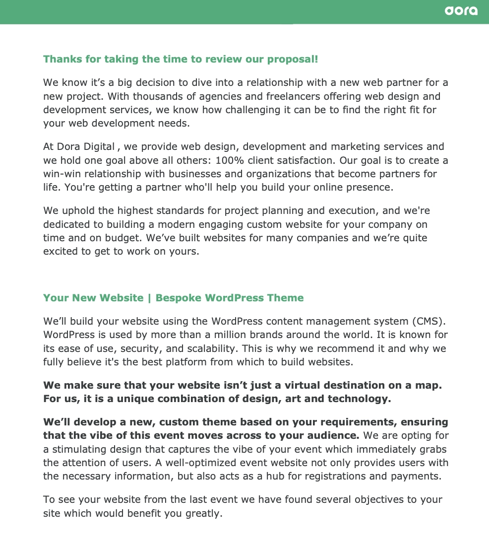
Things become more interesting as we move on to the introduction, though not in a great way.
The introduction goes on and on about the agency. Who they are, what they do, their values, their commitment to customer satisfaction.
None of those things are bad in themselves, but the problem here is the timing. At this stage, we aren't wondering who they are. We reached out to them, sent a brief, agreed to a discovery call, and asked for a proposal.
What we're looking for now is evidence that they understood us.
This would have been a good place to talk about the challenges discussed and reference the goals we mentioned. Something specific that tells us this proposal couldn't simply be sent to the next company on tomorrow's schedule.
Scope and objectives
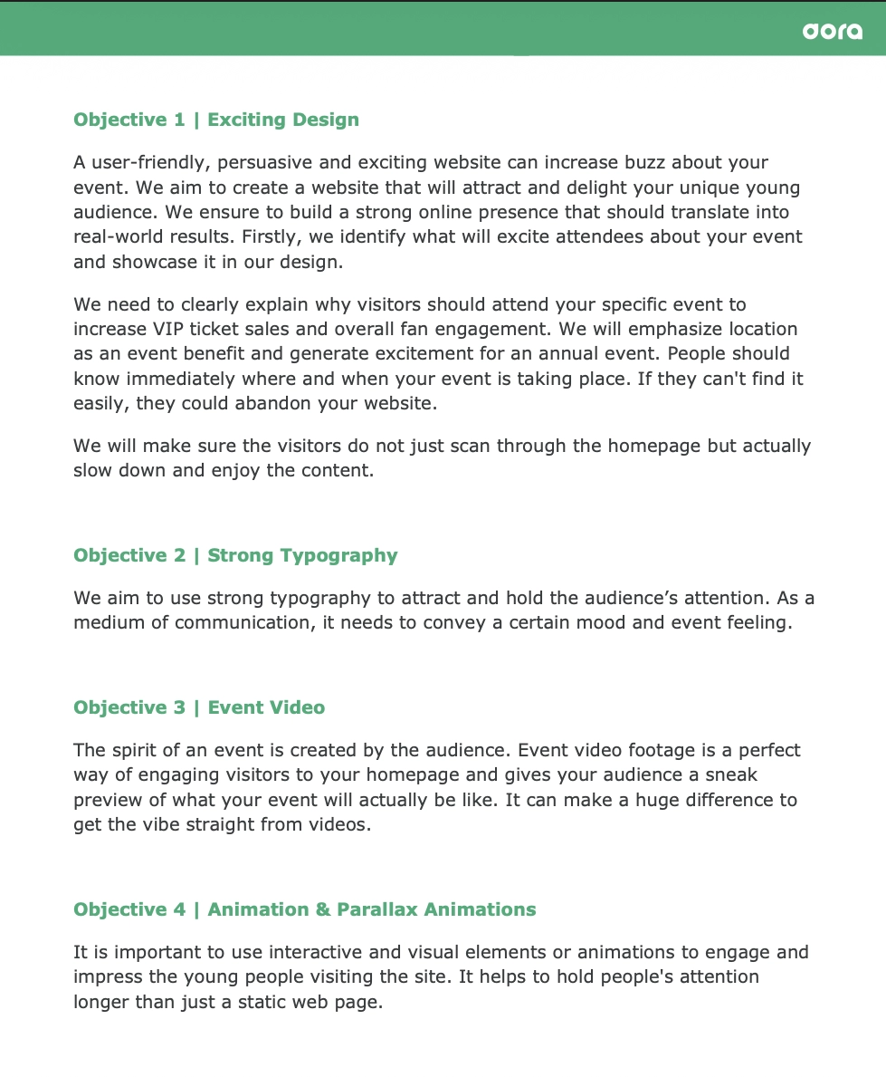
So far, we haven't read too much about our specific website, and that trend continues here. This is where the proposal starts meandering through a large collection of ideas.
Typography. Event videos. Animations. Countdown timers. Testimonials. Attendee engagement. VIP ticket sales.
A lot of it feels very generic, almost as if someone googled "things modern websites should have" and kept adding them in.
As we get to the points about typography and visual communication, we can't help but notice the irony. For a proposal that spends time explaining the importance of both, it presents us with walls of text.
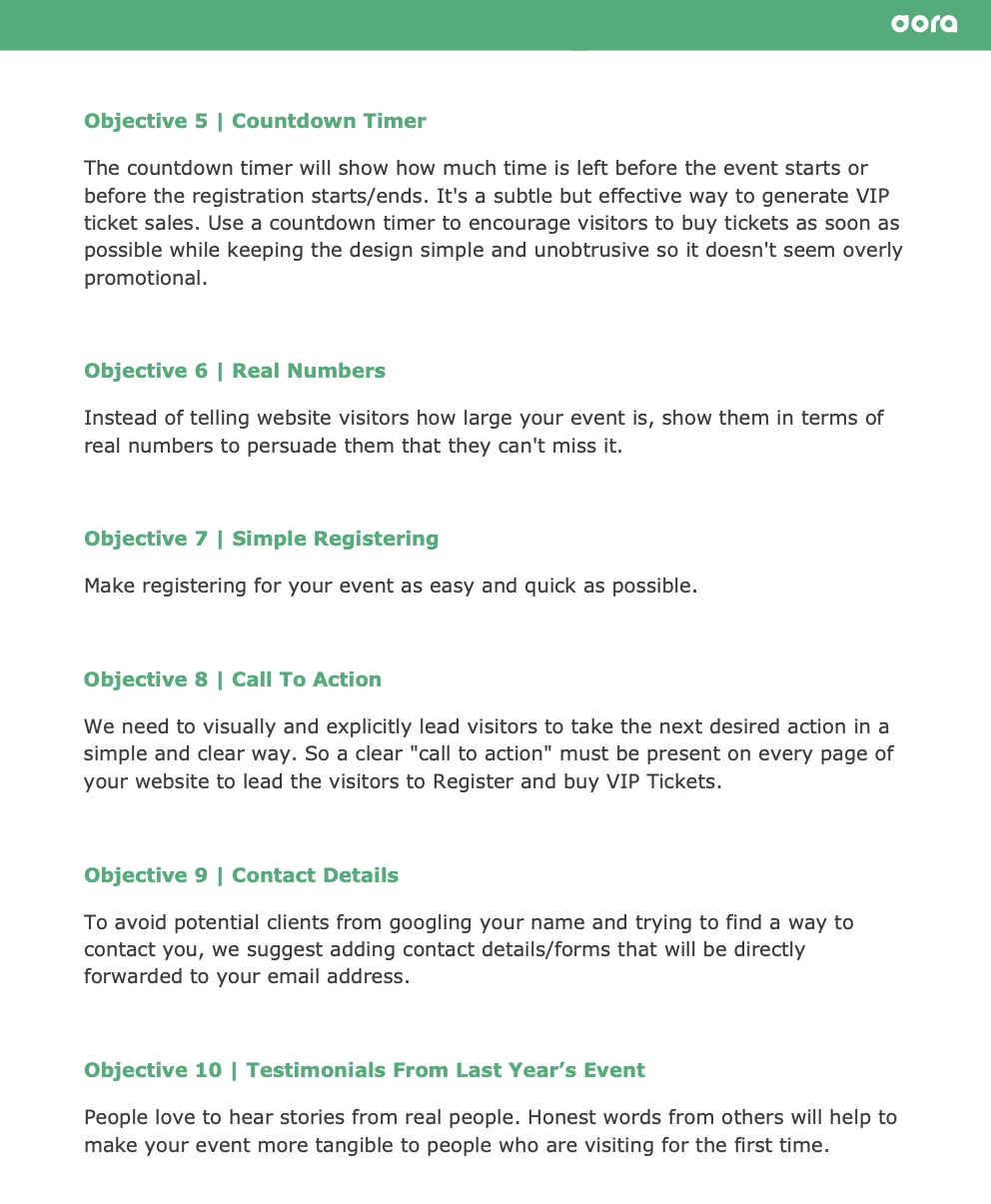
Page after page arrives in long, uninterrupted blocks with very little visual structure and not much helping the eye along.
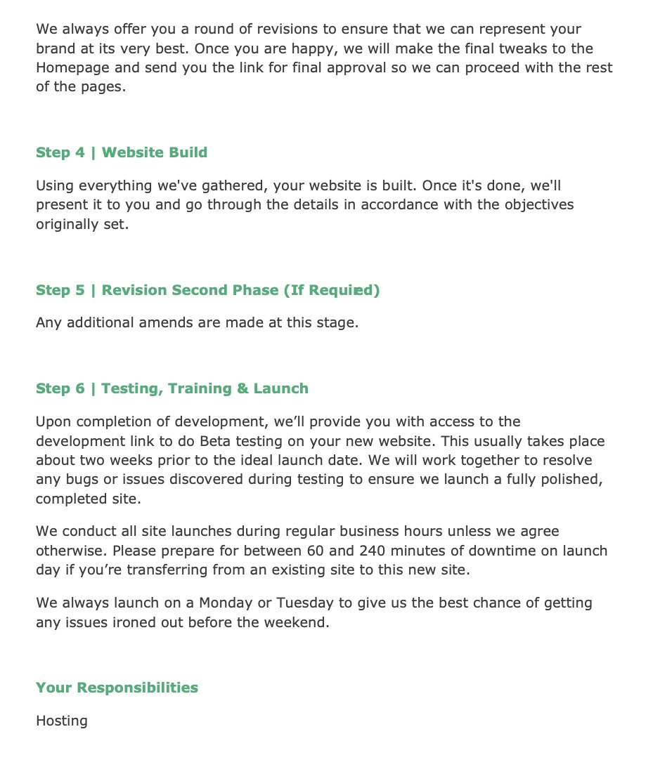
Project process
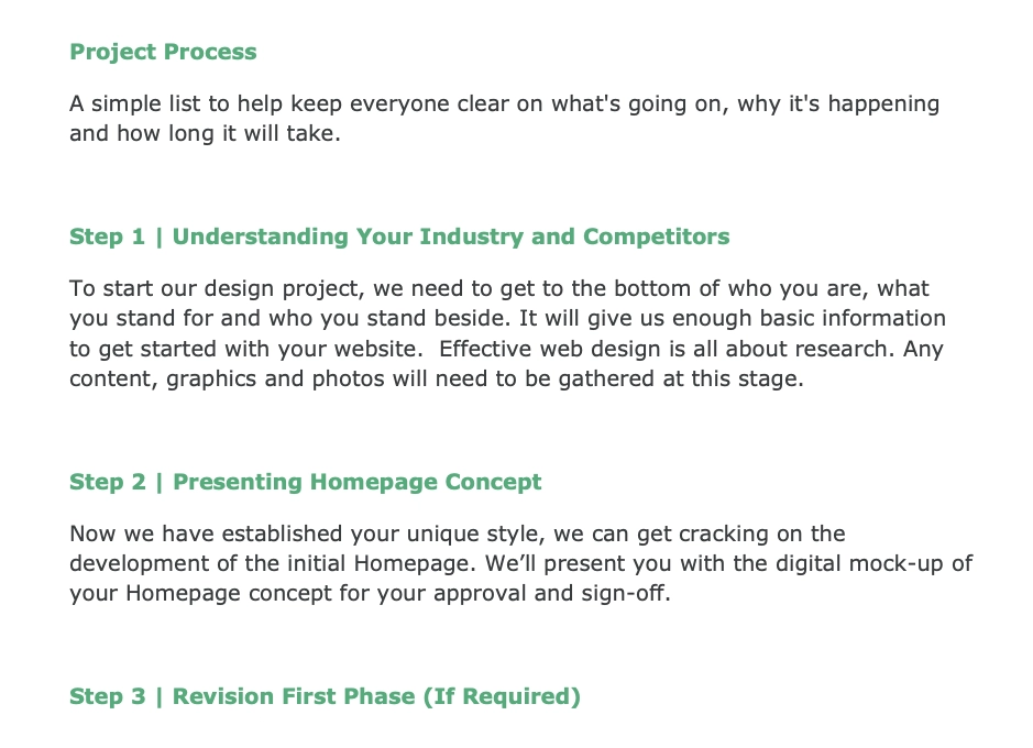
The lack of visual structure continues into the process section of the proposal, which is a shame because this is one of the best parts of the document. The tone finally shifts from "here is a list of things we know" to "here's exactly what will happen".
They explain the testing process, they set expectations around timelines, mention possible downtime, and explain why they prefer launching on specific days. You come away with the feeling that these are people who have done this before.
It took us a while to get here, but this section achieves what the introduction never quite managed. It creates confidence, reassures us that there is a process backed by experience, and that somebody is steering the ship rather than making it up as they go along.
Another great thing that they've done here is explicitly stating what is and isn't included. This leaves everyone less room to assume and clearly lets us know what we'll need to deliver to keep the project on track.
Terms and conditions
If you're wondering what the terms of the contract are, we couldn't tell you. Instead of including them as a section of the proposal, they've linked out to a page on their website.
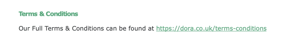
We couldn't be bothered to click on the link and, if we're being realistic, a lot of clients probably won't either.
People read what's in front of them. If something important requires leaving the proposal and opening another page, it immediately becomes less likely to be read.
There is also a bigger issue than not clicking on the link here. Websites change. Terms get updated.
If somebody signs the proposal today and a disagreement comes up six months later, what exactly were the terms when the agreement was signed?
The terms shouldn't live somewhere else. If you're asking someone to sign a proposal, the terms need to be inside the document. They can be a separate section at the bottom of your proposal, but you have to make sure everyone knows exactly what was agreed, with no ambiguity later on.
Your investment
The pricing section gets off to a good start. Calling it "Your Investment" is smart because words matter.
Investment frames the conversation around value and outcomes. Cost frames it around spending money.
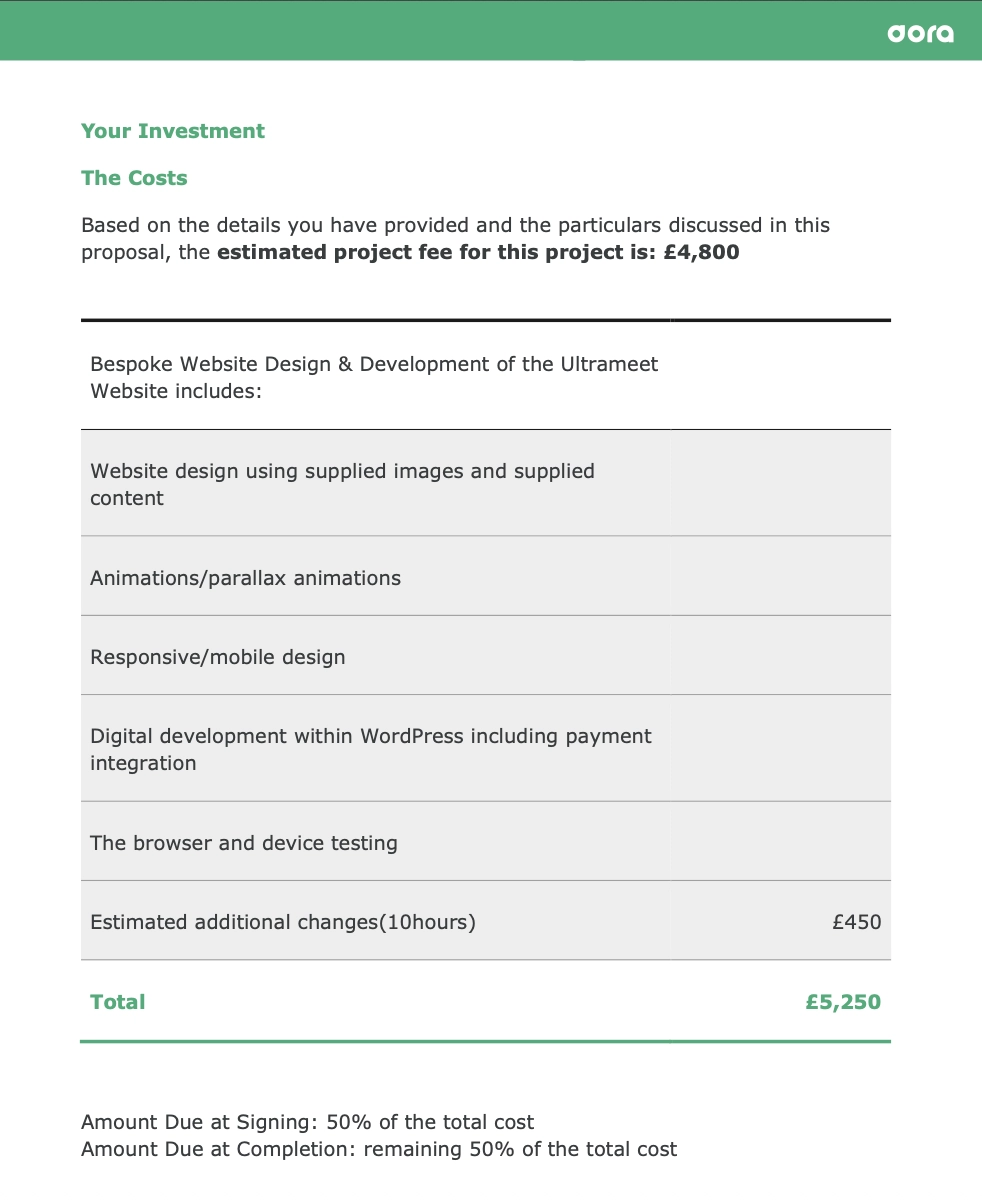
Then, immediately underneath, we get "The Costs", which defeats the purpose of calling it an investment in the first place.
It's a small thing, but language sets expectations. If you're deliberately positioning the work as an investment, you need to carry that idea through rather than abandoning it after one heading.
Things get worse before they get better because they tell us the estimated fee next. We've already shared the brief, done the discovery call, and given them the chance to ask questions.
So if we're still estimating, what's missing?
If something wasn't clear, ask and give your client a definitive price. That's the whole point of discovery.
As we continue reading the pricing section, things become even more odd. They've already told us that hosting will be our responsibility earlier in the proposal, yet now it appears as an optional item.
There is also an Assurance Plan line item, though they never actually tell us what that means. For £150/month, you'd expect at least a line item description that gives you some idea of what you're paying for.
Last, but not least, we have the express delivery option at 25% markup and a 5% discount for upfront payment. The problem is, none of this is actually calculated for us.
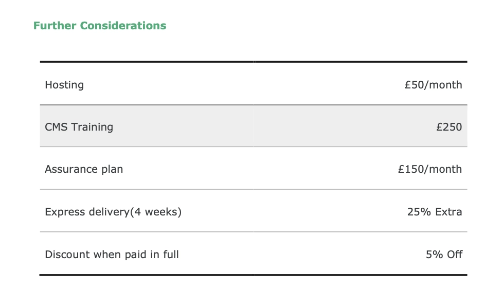
Now we're doing math, which is already slightly irritating. It gets better though, because we don't even have an exact number to start with.
Since we were given an estimate rather than a final total, what are we adding the 25% onto?
By the end of the pricing section, we've somehow gone from reading a proposal to solving an equation with unknowns.
Next steps
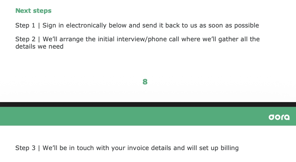
After a pricing section that's left us with more questions than answers, we arrive at another thing they've done well: including the next steps.
Sign the proposal, arrange a call, set up billing. That's good. People like knowing what happens after yes.
The problem is that we're told to sign electronically, but the proposal arrived as a PDF. Now we're wondering what electronically means here.
Are we printing it, signing it, and sending over a scan? If yes, who are we sending it to?
Are we supposed to be adding a digital signature using some separate tool? If yes, which one?
This isn't a small detail. This is the point where somebody is trying to become a customer.
This page of the proposal should make saying yes effortless. The moment people have to stop and work out what to do next, you've introduced friction at the worst possible moment.
The big picture
Overall, this isn't a hopeless proposal. There are good things in here.
The process is strong, the launch section builds confidence, and at several points you get the feeling these are people who know what they're doing.
That said, small things keep popping up and introducing unnecessary confusion. A title that doesn't match the project. Pricing that raises questions. Terms living somewhere else. Extras that aren't explained. Next steps that make us stop and figure out what they mean.
None of these things are dealbreakers on their own, but they do add up. A lot of them also happen to be the sort of problems proposal software is designed to solve.
Digital signatures instead of emailed PDFs. Terms built directly into the document. Automatic pricing calculations. One place for everything, instead of sending people off to websites, calculators, and email chains to piece it together themselves.