Proposal Format: The Best Structure for Winning Business
You can usually tell whether a proposal is going to win within the first few pages, and it's not always the one with the best solution or the lowest price.
It's the one that makes the decision feel easy.
That might sound unfair. Surely buyers make rational decisions after carefully reviewing every page?
If you've ever bought software, hired an agency, or signed off on a project, you already know that's a fantasy.
You skim. You jump ahead. You look at the price.
You check how much effort the project will take, and then you decide whether the rest of it is worth reading.
That's exactly what your prospects do, too.
What we'll cover:
Start where the client starts
One of the biggest mistakes businesses make is treating proposals like mini company brochures.
The first few pages proudly explain the company history. They introduce every service. They include a page full of awards, another about company values, and a photo of smiling employees wearing branded polo shirts.
Meanwhile, the client is wondering one thing: "Can these people solve my problem?" Everything else is secondary.
Your proposal should continue the sales conversation you've already started, not rewind to the beginning.
Every buyer follows roughly the same mental journey
By the time you're writing a proposal, you've already exchanged emails and had a discovery call. You've discussed the client's goals, challenges, and budget.
Now your job is to reinforce the trust they've already started to build. The easiest way to do that is answering the questions every buyer has before they're comfortable saying yes:
- Do they understand what we're trying to achieve?
- What exactly are we getting?
- Can they deliver what they're promising?
- How much does it cost?
Every section should answer one of those questions, in the order the buyer naturally asks them. Do that, and your proposal feels effortless to read.
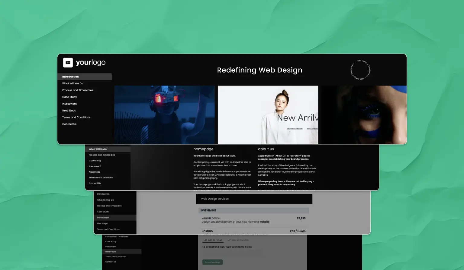
The proposal format that wins business
While every proposal is different, the strongest ones follow the same structure. Each section builds on the last, answering one of the client's questions and making it easier to move towards a decision.
1. The cover page
Your cover page has only one job, and it's to reassure the client they've opened the right document.
Keep it simple. Include the proposal title, your client's name, your company name, and the expiry date.
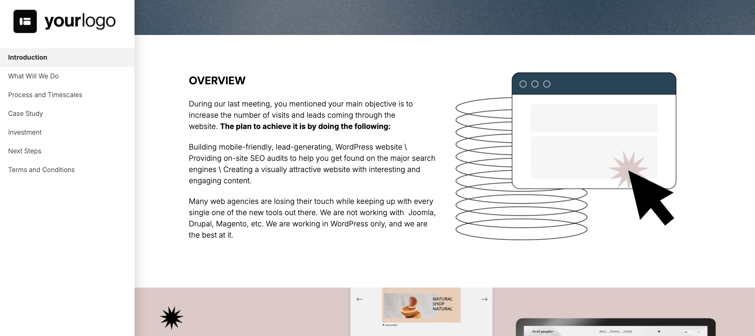
2. The introduction
Your introduction is one of the two sections clients spend the most time on. It's also where you start answering their first question, so you'd better make it count.
Resist the temptation to talk about yourself and open with an introduction that reflects the client's world back to them. For example:
"You've told us your current website no longer reflects your brand. It's difficult for your team to update and isn't generating enough enquiries. Visitors are leaving before finding the information they need, while your marketing team relies on developers for simple content changes.
This proposal outlines how we'll redesign your website to improve the user experience, increase conversions, and give your team complete control over managing the site moving forward."
If your client reads the introduction thinking, "That's exactly our situation," you've done your job.
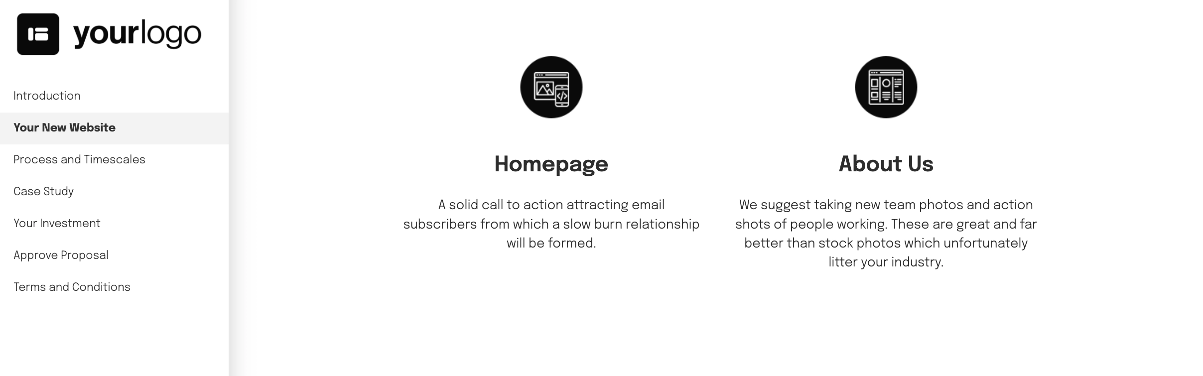
3. The project overview
Now that the client knows you understand their problem, they'll want to know what you plan on doing about it.
Think of the project overview as a sort of bridge between the introduction and the detailed timeline. This isn't the place to list every page you'll design or every feature you'll build.
Instead, explain your approach, why you're recommending it, and how it helps the client achieve their goals. You'll cover the details in your next proposal section.
4. The timeline
This is where your solution starts to feel real.
Up until now, you've explained the client's problem and introduced your solution. The timeline turns that into a plan the client can actually picture.
Break the project into clear stages so they can see what happens, when it happens, and where they'll be involved.
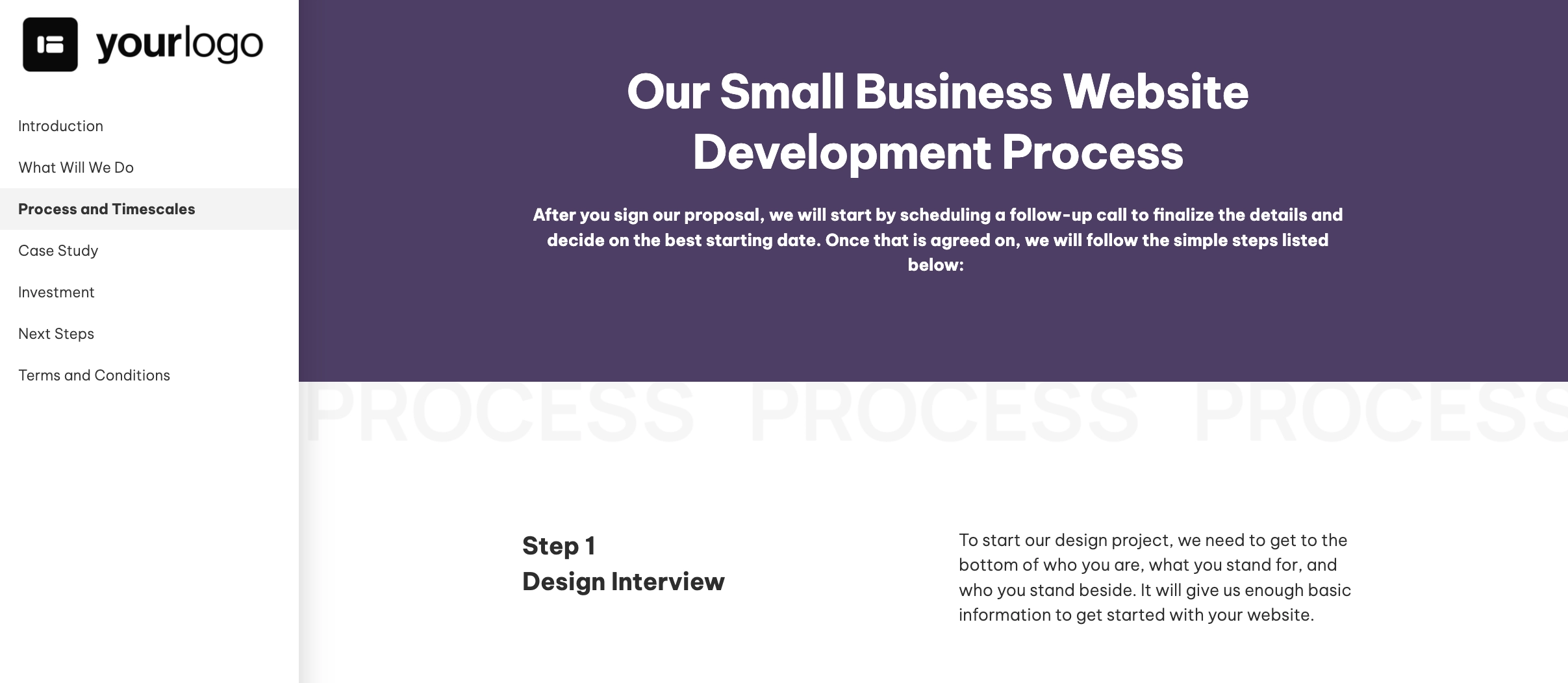
Projects feel far less intimidating when people can picture how they'll unfold. Instead of buying an abstract solution, the client is now buying a clear plan with a defined beginning, middle, and end.
The timeline answers the practical questions about delivery, leaving your next section to answer the emotional one: "Can I trust these people to pull it off?"
5. The proof
A $14 sandwich at a grocery store? Outrageous.
The same sandwich at an airport? Perfectly reasonable.
The only thing that's changed is the context, and that's exactly what social proof adds to your proposal.
A good case study doesn't just prove you can do the work. It changes how the client perceives everything that comes after it.
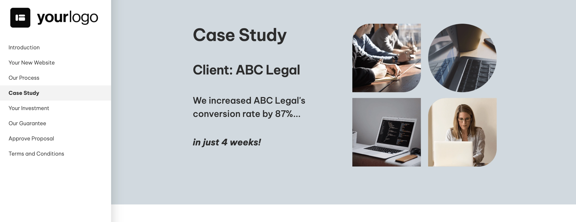
When choosing a case study to include, go for the one that's closest to the client's situation as possible. The closer the match, the easier it is for the client to imagine getting similar results.
Instead of seeing a company making promises, they now see a company that's already solved a similar problem for someone else. And when they reach the pricing, they're now judging the number in the context of proven results.
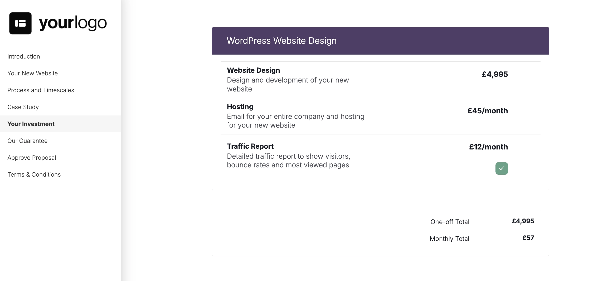
6. The investment
If you've structured your proposal well, the client won't reach the investment section wondering why it costs what it does. They already know.
All that's left is to present the investment clearly. Explain exactly what's included, be upfront about any optional extras, and avoid making the client work for the answers.
Hidden fees, vague descriptions and confusing packages create friction at the worst possible moment.
7. The next steps
Assuming your proposal has done its job by now, the worst thing you can do is get in its way.
Make the next steps obvious. Whether that's signing the proposal, paying a deposit, or booking a kickoff call, your client should never have to wonder what happens next.
Even better, connect those steps together. Once the proposal is signed, the client should be able to pay their deposit, book a kickoff call, and complete any onboarding information without leaving the same workflow.
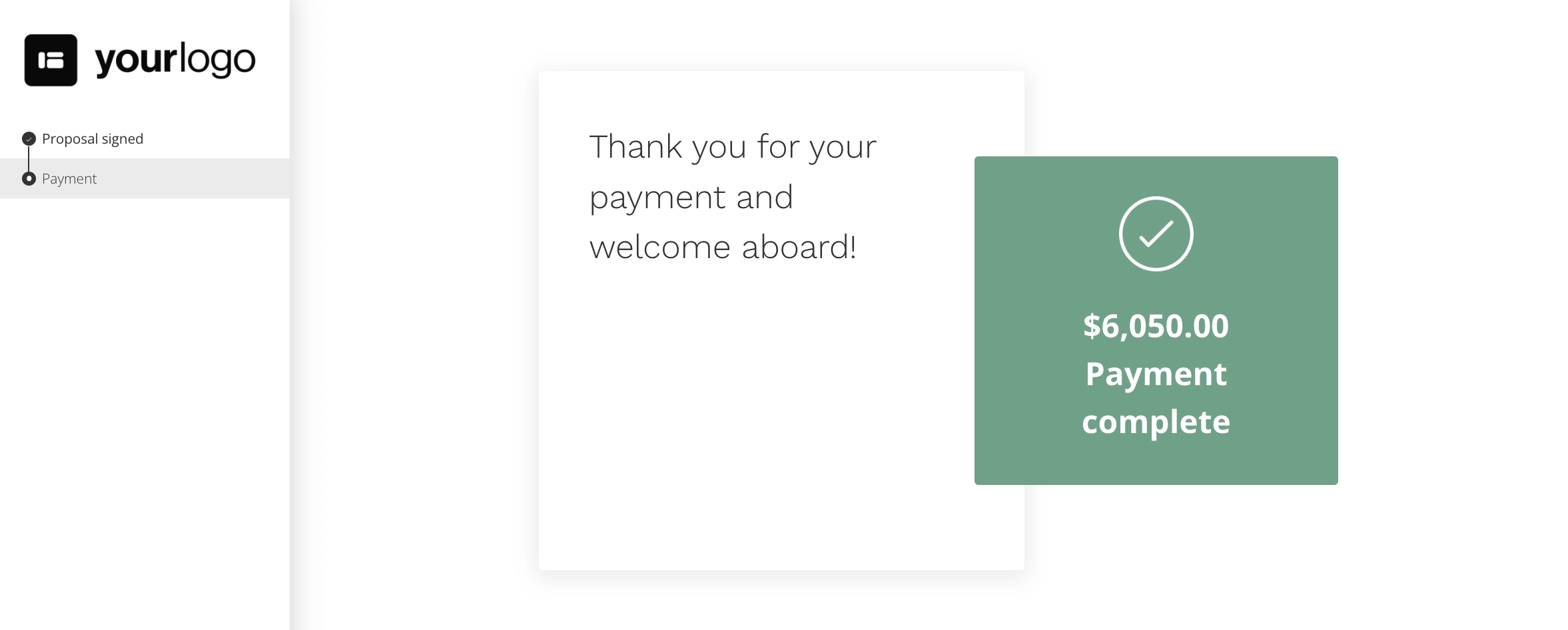
Every extra email creates another opportunity for momentum to disappear. The easier it is to go from yes to getting started, the better the experience is for everyone.
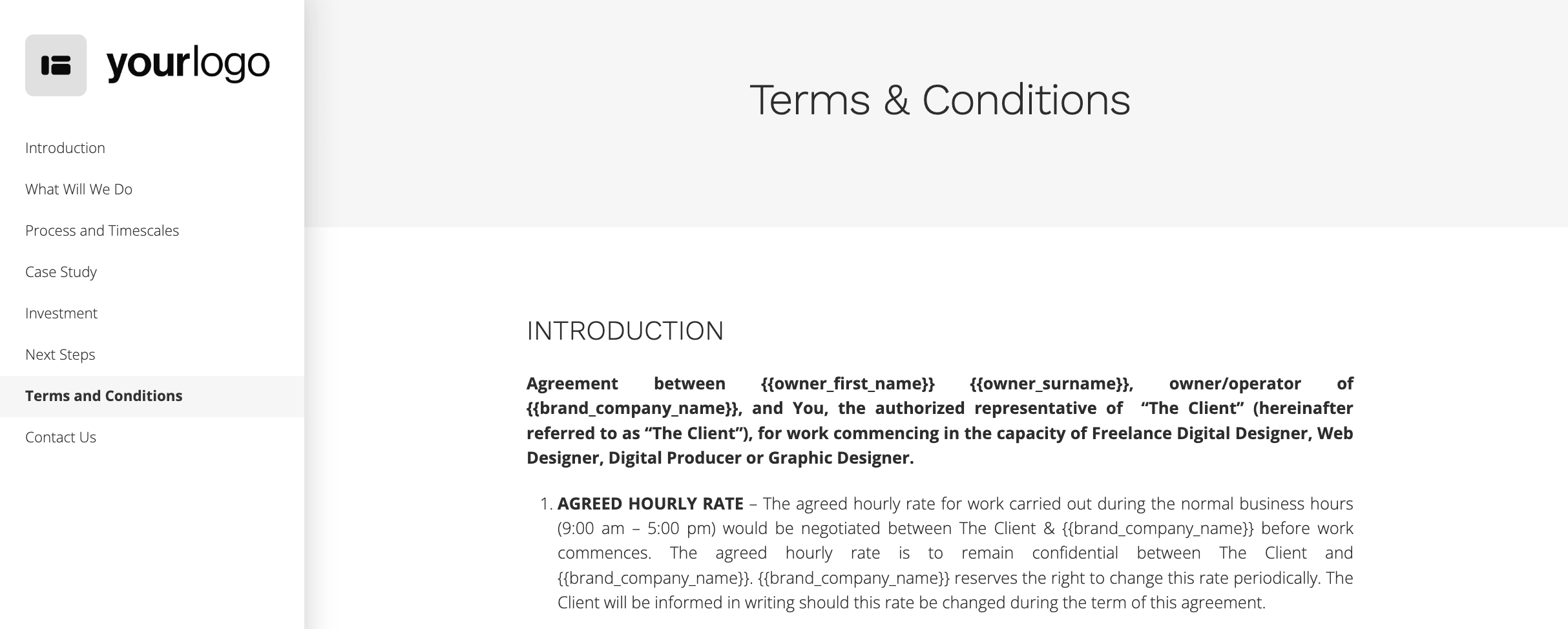
8. The terms and conditions
Imagine proposing to someone. Halfway through, you interrupt the moment to discuss inheritance law.
Technically relevant, but terrible timing. The same principle applies to proposals.
By placing the legal details at the end, you keep the proposal focused on the client's goals while ensuring there are no surprises before they sign.
Terms and conditions should be easy to find, easy to understand and easy to reference, but they shouldn't interrupt the story.
Keep them concise and written in plain English. Cover payment terms, project timelines, revisions, ownership, cancellation policies, and anything else needed to protect both parties.
The five-step test
Here's a small experiment.
Open a proposal you've written recently. Now take five steps away from your screen.
Can you still recognize the structure or does it look like one giant grey rectangle?
If it's the latter, you've got a proposal format problem.
Before your client's read a single sentence, they're already making a judgement about how much effort this document is going to take. A wall of text feels like something they'll have to battle through.
The obvious problem with that is the fact that your client shouldn't feel like they're doing a chore while reading your proposal. The less obvious one is that people don't read proposals from beginning to end.
They skim. They jump to the sections they care most about, then decide whether it's worth reading the rest.
A good proposal format makes that easy. Clear headings, a logical structure, and plenty of white space help people find what they're looking for without thinking about it.
That's the goal. If your client is thinking about where to find information, they're not thinking about hiring you.
Final thoughts
Proposal format isn't about making a document look pretty. It's about removing friction.
Every extra click, unnecessary paragraph, and confusing section gives your client another excuse to put your proposal aside.
The best proposals don't win because they're longer or more detailed. They win because they're easy to say yes to.
Want to create proposals with built-in pricing, approvals, payments, and client onboarding? Try Better Proposals for free. It gives you the structure, tools, and templates to create proposals that are easy to read, easy to approve, and easy to win business with.