Transfer your content organization
If you have an InDesign template, your content is already organized into sections and blocks, so it’s only a matter of transferring it. In the Better Proposals format, sections are the titles on the left of your proposal, and the blocks are the natural section breaks.
A good rule of thumb is to keep the section division simple. For example, your intro would be one, your pricing would be another, your specification would be another, etc. When it comes to blocks, you can split them up by whatever looks right visually, like paragraphs for instance.

Set up your pages
Since you already know how many sections you need based on your InDesign proposal structure, you can start creating your template. To do that, click on Templates in the menu and then on the Create New Template button on the top right of the screen. Once you’ve done that, a new screen will open where you can name your template. When you’ve decided on the template name, Next and you’ll find yourself in the Editor:

Since you’re starting with a blank template, now is the time when you’ll need that number of sections we mentioned earlier. Click on the plus sign on the left right under your brand logo, add the required number of sections, and rename them by clicking on the Settings icon.
Once your sections are set up, it’s time to add the blocks to each section. Pick the section you want to edit in the menu you’ve just created on the left and add as many Content Blocks as you need. To do that, simply click on the plus sign in the middle of the Editor. Honestly, this part is a little repetitive but, once you’ve got your structure sorted, it’s just a matter of pasting it in.
Paste in your content
This step looks just the way it sounds. The Editor will strip out most of your formatting, you’ll want to re-set up your header text and formatting once you’ve pasted your content in. On the bright side, it only takes a few seconds. Just highlight the word or phrase you want to format and select H1, H2, H3 for different sizes. Here’s how to do it:
Set up your brand colors
Setting your brand colors up in advance makes life a lot easier. Press Save and exit, exit the Editor and click Settings. From there, you’ll see Branding in the menu on the left. Click on the brand you want to edit and add the main colors you normally use. By doing this, you’re making your brand colors instantly available in the Template Editor.
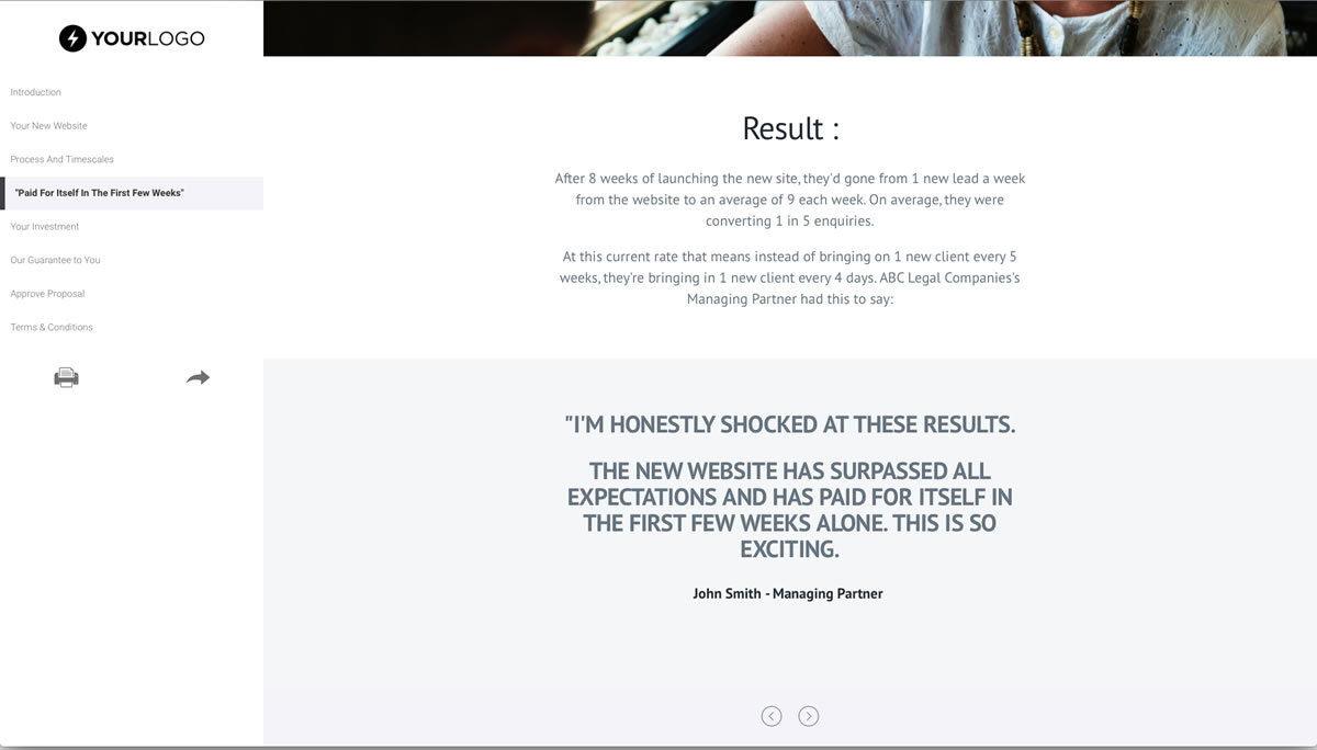
And since you’re already adding colors, it’s also worth adding in 2 dark ones, such as a black and very dark grey, along with white and a light grey. You can then use these as alternating background colors on your blocks to have this effect:

Make your template look on-brand
Now it’s time to color in your template with your brand colors. By clicking on Settings on each block, you’ll see the sidebar with a whole host of different options. From here, you can add background images, filters, videos, patterns, trims, and more. But for now, let’s first get the template colored in - you can always play with the effects later.
As a good rule of thumb, first choose a theme (light or dark) and alternate the colors top to bottom in each section. You can then use your brand colors to make certain parts stand out, like a call to action, an important point or a section header.
There are plenty of ways you can use your brand colors to make an impact, but this one never fails. It’s also a great starting point. And want to hear a little inside tip? Start by picking the light or dark theme, skip to the next section, and add your imagery. Once you’ve done that, go back and add your brand colors. Sometimes, images are enough to bring your proposals to life, so you can use your brand colors more sparingly to avoid overwhelming visuals.
Add imagery and bring your template to life
Adding images to spice up the look and feel couldn’t be easier. Click on the plus sign between Content blocks, and then on Full width image. From there, you can either upload an image or add one directly from Pexels or Unsplash by typing in keywords into the search box.
Special effects
As one of the best equipped proposal editors around, Better Proposals has no shortage of different things you can do with your content and designs. That said, you don’t want to go overboard. Here are some guidelines on how to use each of the different elements to make your proposals look classy and professional without veering into gimmicky.
Trims - Pick a style and stick with it. There are several available angles of straight trims. Mix and match those, but try to avoid having a straight one and then a curved one immediately after.
Columns - Best used when you’re doing something like a team page with a headshot on the left, bio on the right. Or you’re trying to illustrate steps in a process.
Normal and Wide mode - Good to mix and match these to keep things interesting for people on bigger screens. Content like testimonials or contracts works well in wide mode.
Background videos - Use these sparingly. Not only will they slow down the loading speed if you go too mad, but they can also be quite distracting if you overcook it. Any more than two in the template, and it can start to ruin the effect.
Background patterns - Just pick one and stick with it for special content such as a call out of some sort. Great for the odd branded block with a testimonial in it.
How to use it going forward
Your template will be the starting point of all your proposals. As you settle into using Better Proposals, you’ll duplicate your Template and make amendments for different services or different types of clients or situations.
You can also save different sections or blocks to the Content Library, which means you can pull in content without having to start an entire template from scratch.
You will naturally know which parts of your template need to be amended for each client. Some of it you’ll just leave as is, other bits will take a little tweak, and some will be scrapped or re-written entirely. The idea is to make it as streamlined as possible. That way, you know which bits need editing and you can get the proposal done and sent as quickly as possible.